
The Hebrew University of Jerusalem (HUJI), established 1925, is Israel’s first & most prestigious university and its leading research institution. HUJI is ranked internationally among the 100 leading universities. Its audience is potential students and researchers, students, faculty, alumni and donors.
The Hebrew University regards itself as a symbol of Israeli culture, as an educator of Israel’s future generation and as Israel’s largest center of knowledge. However all this is often obscured due to HUJI's controversial location on the border of East and West Jerusalem, an “archaic” perception amongst young Israelis, multiple campuses and faculties and an obsolete and inconsistent appearance. This graduation project rebranded the iconic institution by examining its history and implementing this equity with HUJI's present and future values. The new branding creates a fresh, exciting and relevant visual identity, while bringing forward HUJI's long legacy.
Because of the University's significant history, the initial approach was to research the “design heritage” of the institution, concerning both its architectural planning and graphic communications. Upon discovering the rich and neglected “graphic legacy” of the University, it became clear that the concept should revive the beautiful typography and aesthetic of the past, while creating a new, innovative identity. This was accomplished by refreshing a forgotten proprietary font and modernizing their historic logo. The graphic system and visual language created, achieve the goal of combining old and new, past and future.

The result of an internet search when looking for "The Hebrew University logo". Except for the symbol, which remains similar (though not precise), no design elements are consistent. The colors are different in each logo, the fonts change, the shape in which the symbol appears varies, and even the primary language is unclear.
The hallways of the University display a similar problem as above. The photographs shown were taken on a single corkboard in the University.
The hallways of the University display a similar problem as above. The photographs shown were taken on a single corkboard in the University.

In addition to the inconsistency of the University logo, the wayfinding on campus is nearly impossible. There are virtually no two signs in the same visual language. However in all the chaos, only one element repeated itself - a signage font.
Further research indicated that this "mysterious" font appears throughout the two campuses of The Hebrew University, applied to both interior and exterior signage and in films of the University dated from 1958. The font was used for the logotype, as well as the main signage font for the various departments of the University.
Additional investigation revealed the name of the University's designer in those years, Emanuel Grau (through an archive document proving he hadn't been payed in time!).
The calligraphy based font he designed is named "Universal", derived from "University". Grau was commisioned by the University to design a font for the opening of the University's new "Givat Ram" campus in 1958.
Due to the symbol's historical significance, the concept for the redesign of the logo included modifying the existing symbol to update it to the present and future: the shape of the flame was changed to a geometrical form, to be in accordance with the rest of the symbol; the shape was straightened slightly, creating geometrical balance and a precise, clean look; the symbol was divided into the basic forms it was built from to examine the geometry; and colors were added to the newly created shapes.
A trilingual logotype was created with the symbol. Arabic was added to the logo for the first time. Hebrew font: implementation of the newly digitized "Universal" font as logotype. English and Arabic font: "The Sans" to balance the calligraphic style of the Hebrew font.
In addition to the official logo, a casual, abbreviated "spoken version" of the logo was created, using the University's nickname amongst its students "The Hebrew". HUJI is an acronym for "Hebrew University of Jerusalem, Israel", commonly used today.
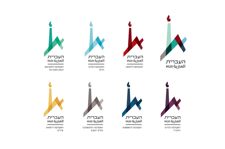
Color coding, based on the main logo, was created for each of the seven faculties of the University. From right to left: Faculty of Medicine; Faculty of Humanities; Faculty of Agriculture, Nutrition and Enviromental Studies; Faculty of Social Science; Faculty of Law; Faculty of Mathematics and Science; and Faculty of Dentistry.

Merchandise implementing the new visual identity.


A series of brochures, addressing different target groups: applicants, students, graduate students and potential donors. The Albert Einstein quotes appear on each cover, representing his strong connection to the University. Following his death, Einstein willed his personal archives and the rights to his works to the University.


A new website, implements the graphic languge and is a functional university website containing much essential information for students and faculty. It allows easy navigation and access to information that was very difficult to find on the University's current website such as maps, student services, easy sign-in, event calendars, etc.

BEFORE & AFTER
Using the new visual language, a grid and photographic system for event posters was created. The posters are "color-coded" according to the faculty which is hosting the event. The duotone imagery and the dynamic grid create a connection between events ranging from literary conferences (second on the left) to space research conventions (far right). Each "after" poster represents the "before" poster directly above it.


